Designing an All-in-One Social Planning Experience
JIO is a mobile application designed to help friend groups plan gatherings more easily by consolidating scheduling, activity inspiration, and expense management into a single platform. As the UI Designer, I contributed to the project’s branding, interface design, and high-fidelity prototype, translating research insights into a friendly, approachable visual system that supports complex group coordination without feeling overwhelming.

Friendly Branding and Progressive Disclosure
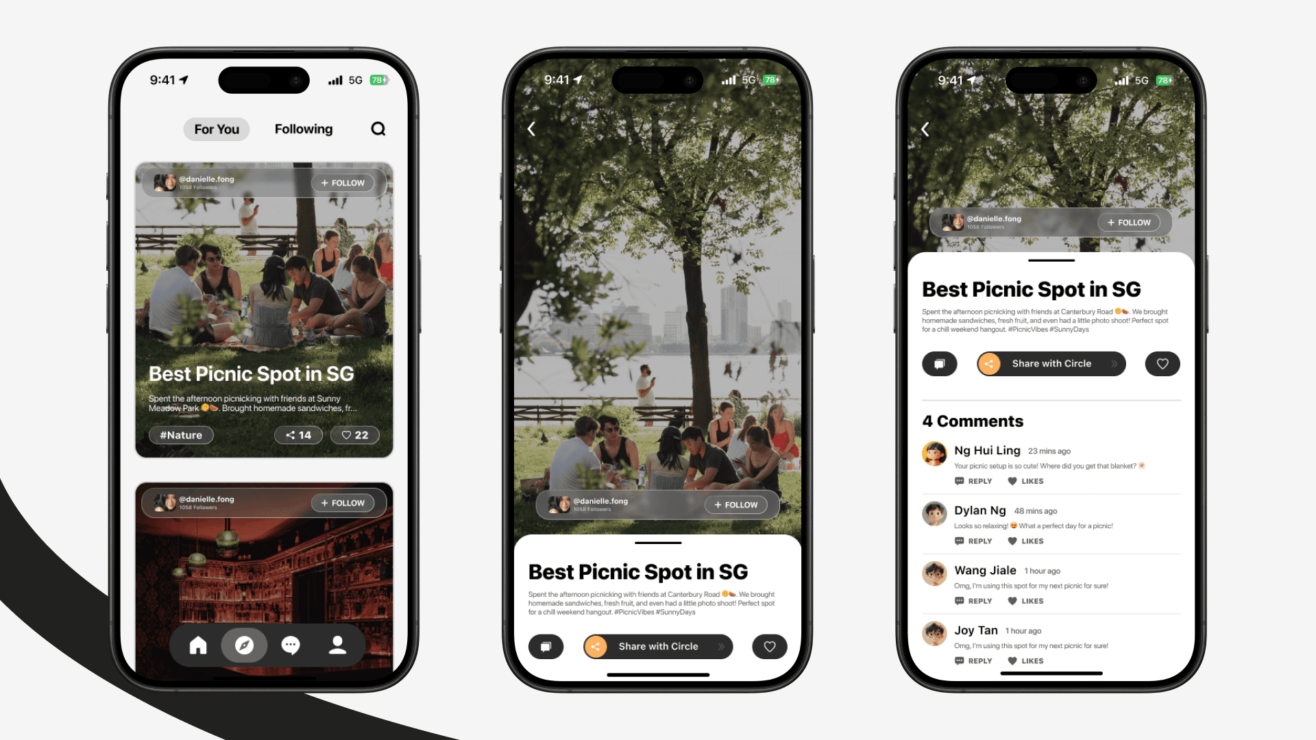
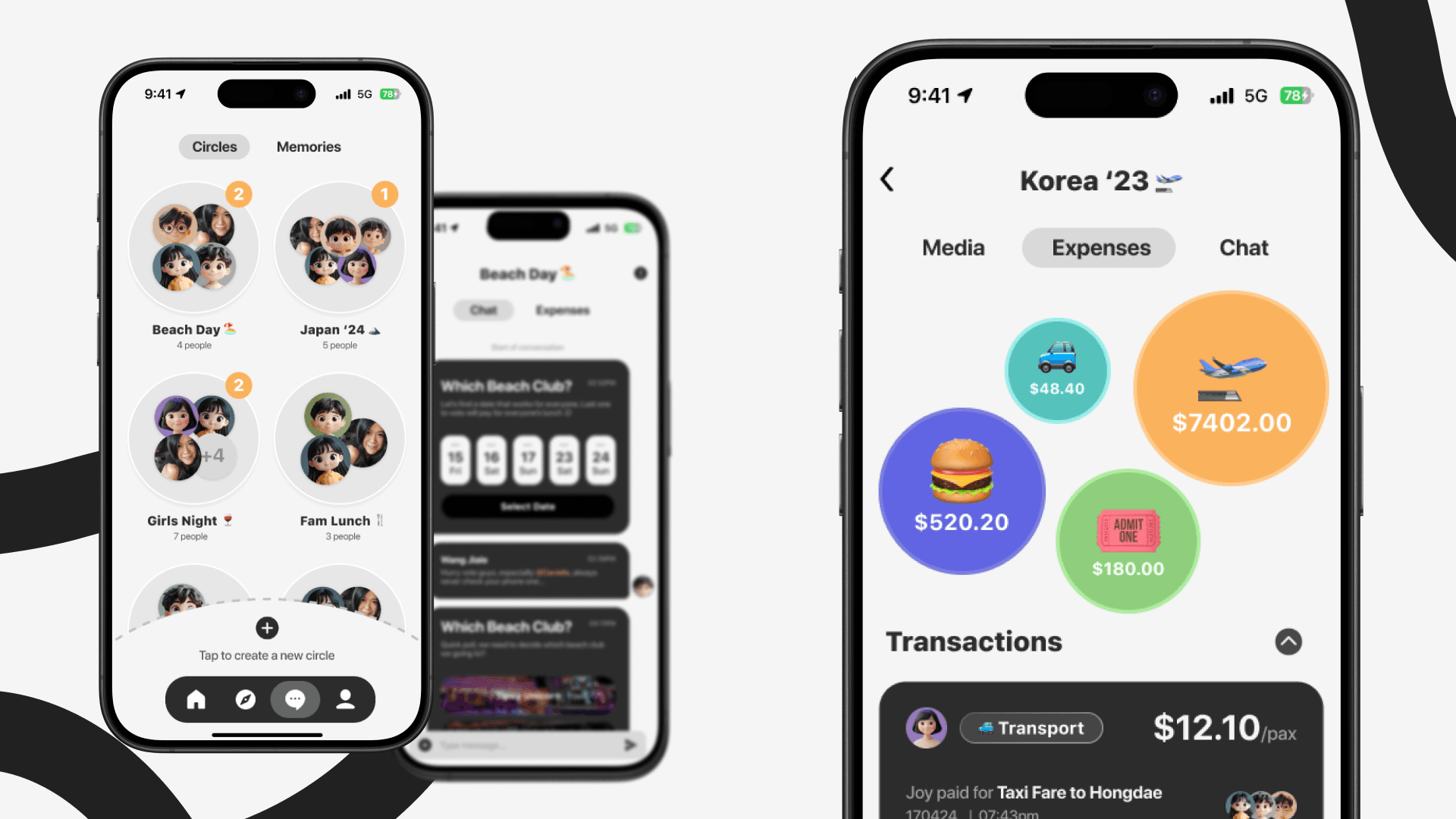
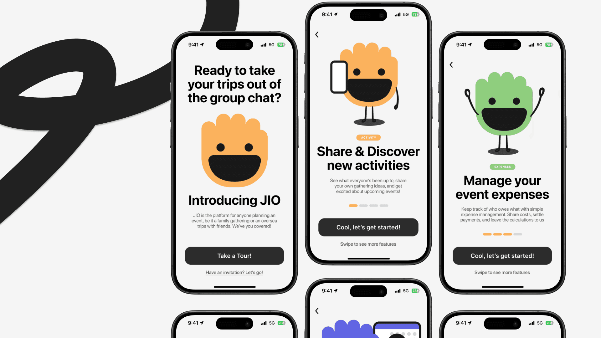
To address this, the design leaned into a bright, friendly brand identity inspired by social apps, using mascots, stickers, and a pastel colour palette to lower emotional friction. Functionally dense features were broken down into clear modules and progressive flows, allowing users to engage only with what they needed at each stage. Usability testing on low-fidelity prototypes helped surface issues around wording, navigation clarity, and visual density, which informed refinements in layout, labelling, and hierarchy before finalizing the high-fidelity design.
Social UX Requires Emotional and Cognitive Sensitivity
This project highlighted that designing for social coordination is as much about emotion as efficiency. I learned the importance of aligning brand tone, visual language, and interaction design to reduce planning fatigue and encourage participation. Most importantly, JIO reinforced how research-driven design decisions and restraint in feature are critical when building products that aim to replace or improve deeply ingrained user habits.